To change the basic appearance settings such as core colors and graphics, select the Appearance tab using the left-hand navigation bars. You will see two additional tabs appear: Core Graphics and Theme (Fig. 1). Within each of these tabs, you can make key stylistic choices regarding the presentation of the app.
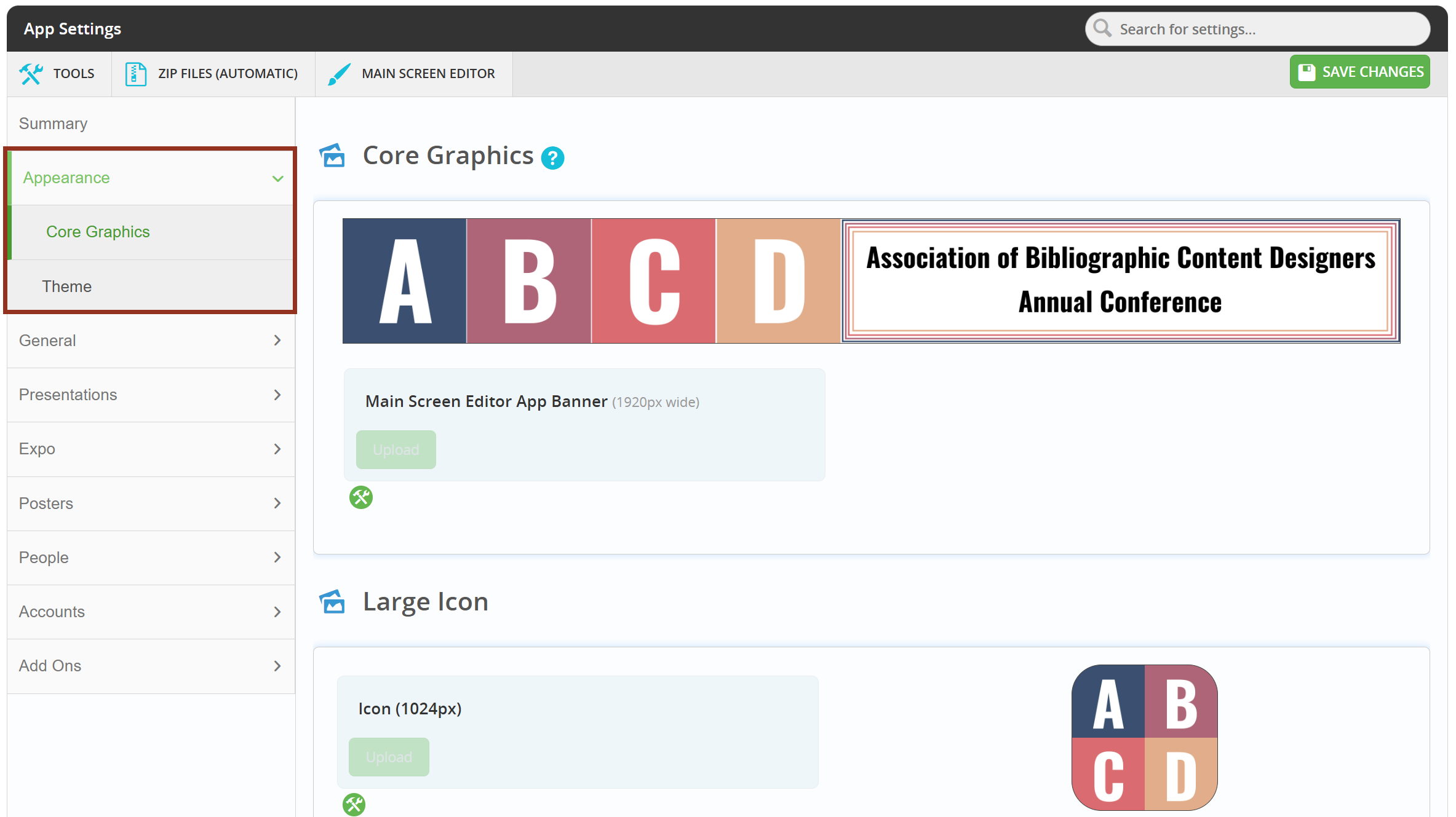
Fig. 1 - Appearance tabs.
Core Graphics
On this page, you are able to upload images that appear to the users. These images include a banner graphic, a large icon, and a small icon.
Banner Graphic
This is the image that will display across the top of the desktop version of the mobile app. This image should be a PNG or JPG file. It should have a width of 1920 pixels and a height between 180-280 pixels in order to display properly.
Large Icon
This is the icon graphic that appears in the events listing of the mobile app. This image should be a PNG or JPG file. It should have a width and height of 1024 pixels to display properly in the app.
Small Icon
This is the icon graphic that appears in the events listing of the mobile app. This image should be the same as the large icon, however in a smaller size. The small icon should have a height and width of 254 pixels, and also be in PNG or JPG format.
Theme
On this page, you are able to decide on key colors that will appear within the app. Use the live preview to aid in creating a color scheme for your mobile app.
Header Background Color
This is the color that appears across the top of the App. This appears above the banner. To change this color, you may use the color picker tool, or input the HEX value. This changes the Footer color as well. Changes made in this field will display in the “Live Preview of the App’s Header.”
Header Foreground Color
This is the text color that appears within the header. This text will be displayed on top of the Header Background Color. The options for this field are black and white. You are able to preview the changes made in this field will display in the "Live Preview of the App’s Header."
Login Button Color
This is the color of the button that the user will press after they have provided their login credentials. To change this, enter the desired color in HEX format or use the color picker tool.
Color to Tint Opening Images
This is the color that the images on the login screen will be tinted. These images appear toward the bottom of the app entry page. By default, the color of the icons is set to blue. To change this, enter the desired color in HEX format or use the color picker tool.
Color to Tint Intro Images
After the user logs into the app using their credentials, the user will navigate through a series of pages before reaching the main screen of the app. Each of these pages has icons associated with the functionality. This setting controls the color of these icons. By default, this color is set to blue. To change this, enter the desired color in HEX format or use the color picker tool. It is recommended to choose a lighter color that also appears in the banner.
Was this article helpful?
That’s Great!
Thank you for your feedback
Sorry! We couldn't be helpful
Thank you for your feedback
Feedback sent
We appreciate your effort and will try to fix the article