The chart types determine how the data will be displayed on the dashboard.
The chart types available depend on the report type of the snapshot report you’re adding to the dashboard:
Count Reports:
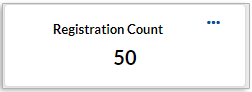
Total
Goal Reports:
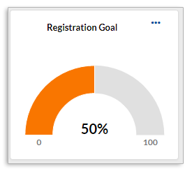
Gauge
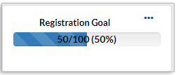
Progress Bar
Timeframe Reports:
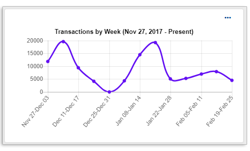
Line

Bar Graph
Comparison Reports:
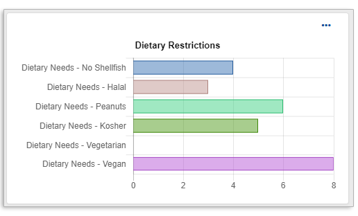
Bar Chart
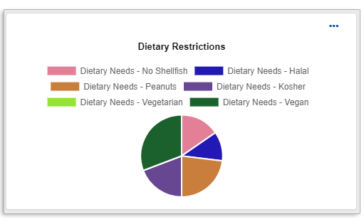
Pie Chart
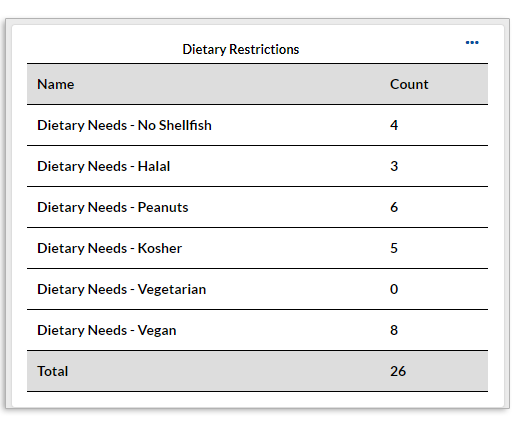
Table
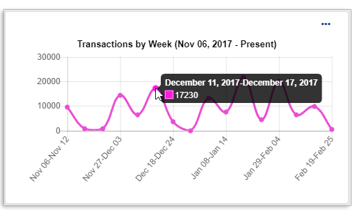
With any of the chart types, you can hover over a point on the chart to display the full details for that data point.
Last modified Sep 18, 2024
Was this article helpful?
That’s Great!
Thank you for your feedback
Sorry! We couldn't be helpful
Thank you for your feedback
Feedback sent
We appreciate your effort and will try to fix the article